Desktop
Desktop
Aktiviteler
Alert
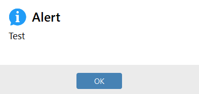
This activity is used to create a customizable window to display a warning, information, or error message to the user. By defining the title, message, color, and behavior properties, a visual notification can be presented on the screen.
Usage Scenarios:
- Informing the user during the workflow (success, error, warning)
- Drawing the user’s attention at specific steps
- Visually indicating errors or exceptional situations
- Using visual alerts for checks during testing and debugging phases
Parameters:
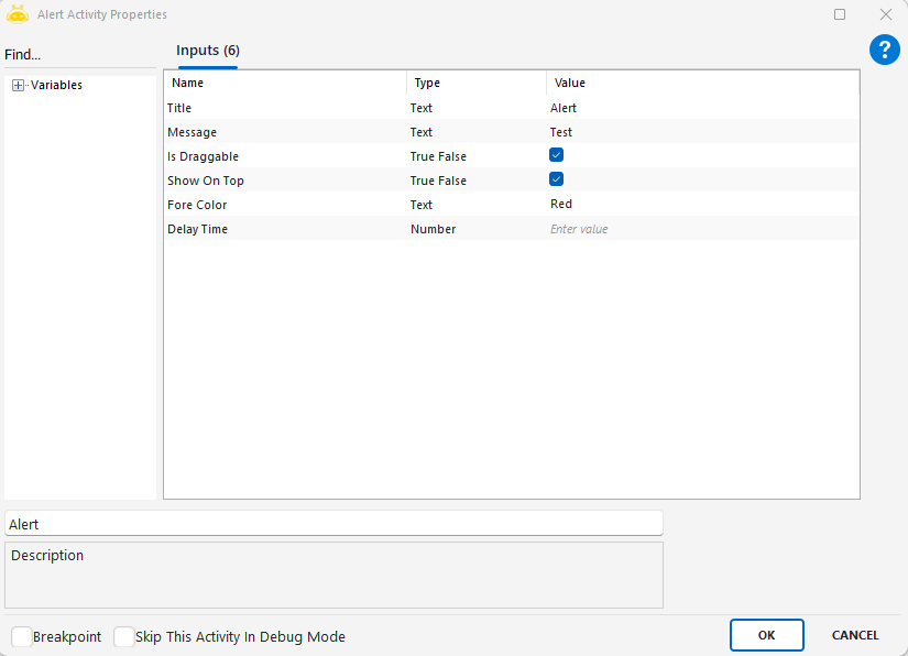
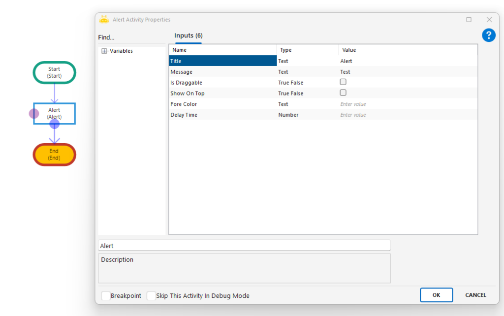
- Title: Defines the title of the alert window. Example: “Warning”
- Message: The main message content to be displayed in the window. Example: “Please complete the form.”
- Is Draggable: Specifies whether the window can be dragged. Example: true
- Show On Top: Keeps the window on top of all other windows. Example: true
- Fore Color: The text color of the message. Example: “Red”, “Black”, “Green”
- Delay Time: The waiting time before the activity is executed (in milliseconds).
Points to Note:
- The color value must be a valid system color; if invalid, the default will be applied.
- The alert window will not automatically close after a certain time; manual closing is required.
- With the Is Draggable and Show On Top options, the user experience can be customized.
- Visual alerts should be supported with explanatory messages, especially in cases that cause errors.
Decision Alert
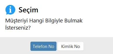
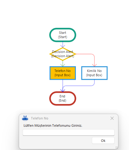
This activity is used to display a two-option decision window to the user. The user selects either “True” (blue button) or “False” (red button), and the workflow continues accordingly. It is especially useful in RDA (Robotic Desktop Automation) scenarios.
Usage Scenarios:
- When user input is required to direct the workflow (e.g., deciding which criteria to use for customer lookup)
- When manual approval is needed at certain steps of the process
- When scenarios can proceed through different paths and require user choice
- When critical decisions such as record deletion or stopping a process should be left to the user
Parameters:
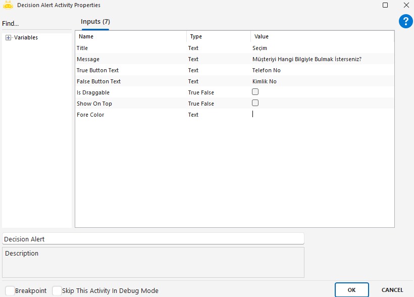
- Title: The title of the decision window. Example: “Selection”
- Message: The explanation text shown to the user. Example: “Which information would you like to use to find the customer?”
- True Button Text: The text displayed on the blue (positive) button. Example: “Phone Number”
- False Button Text: The text displayed on the red (negative) button. Example: “ID Number”
- Is Draggable: Specifies whether the window can be dragged. Example: true
- Show On Top: Specifies whether the window is always displayed on top. Example: true
- Fore Color: The color of the message text. Example: “Red”
Points to Note:
- Based on the user’s choice, the process flow will continue through either the True or False branch.
- True Button Text corresponds to the blue button (positive action); False Button Text corresponds to the red button (negative action).
- The color must be a valid system color. If invalid, the default will be applied.
- The process will not continue until the decision window is closed; user input is required.
Input Box
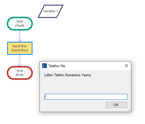
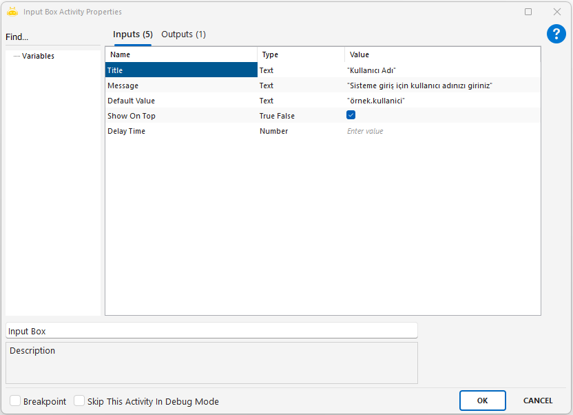
This activity is used to manually collect information from the user and assign it to a variable for use within the process. It is generally preferred when open data (e.g., phone number, name-surname) needs to be collected from the user.
Usage Scenarios:
- When dynamic information needs to be collected from the user
- In RDA processes where operator input is required
- When creating form-like interactive structures with the user
- In scenarios where the user contributes to the process with data input
Parameters:
- Title: Specifies the title of the input box. Example: “Phone Number”
- Message: The explanatory text to be shown to the user
- Default Value: The initial value that will automatically appear when the input box is opened
- Show On Top: Ensures the input box is displayed above all other windows. Example: true
- Delay Time: Waiting time in milliseconds before the activity is executed
Points to Note:
- The entered data is directly assigned to a variable of type string
- If the user does not enter data and the default value is empty, an empty value may be returned
- The process cannot continue until the input box is closed
Password Box
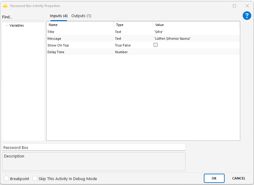
This activity is used to collect sensitive information such as passwords from the user, while masking the entered characters with asterisks (*). The collected data is securely assigned to a variable and can be used within the process.
Usage Scenarios:
- When confidential information such as a password, verification code, or ID number needs to be collected from the user
- In situations where input security is a priority
- When creating a password field in visually interactive user processes
Parameters:
- Title: The title of the password input box. Example: “Password”
- Message: The explanatory text to be shown to the user. Example: “Please enter your password”
- Show On Top: Ensures the password box is displayed above all other windows. Example: true
- Delay Time: The waiting time before the activity starts (in milliseconds). Example: 1000
Points to Note:
- The entered characters are not visible; only asterisks (*) are shown
- If sensitive information such as passwords must be stored, secure storage methods should be used
- If the window is closed without input, an empty value may be returned

